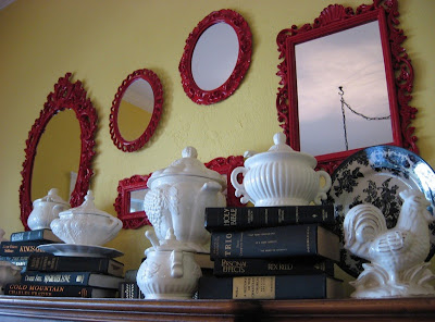
Thursday, June 28, 2012

The Beauty of a Quick Consult

We recently checked in on one of our quick consult projects, we met with our client to see the changes in her new home and to have a little Q & A session with her about her experience. She is a busy, working mom and was struggling trying to prepare two homes, one to rent and the other to move into on top of her daily life. When we asked her why she chose to have a quick consult she said,
"I'm a very busy working mom…I did not have the time to deal with all the nitty-gritty things, even just picking out paint colors. A quick consult was perfect and was very affordable, working perfectly into my budget and my time schedule."
For this project, my client completed my questionnaire to help me know her style and what she wanted from her project. We helped her with space-planning her furniture, selecting paint colors for the rooms. In the living room we decided to remove a small pony wall by the front door and a full wall covering the stair well to create a visually larger open space and give more flexibiity for furniture arrangement. Check out the before and after pictures:

Before - Stairwell Wall
After - Stairwell Wall (don't worry a railing will be installed)
Before - Fireplace Wall
After - Fireplace wall
Soffit built up from the mantle to house wires and support for television.
Before - Pony Wall
After - No Pony Wall
Because the floors were refinished there was no scarring from the demo.
Before - Dining Room
After - Dining Room
The color throughout the house was a nice, warm neutral which really livened up the place from the darker brown that was on the walls before. For the bedrooms we decided to have fun, our client let her kids have "free reign" with our design approval of course. Here are some other after pictures:
One of the girls bedrooms
We went neutral for the boy's room because he will be adding
color with his Red Sox decor!
Here is the other girls room.
We had this paneling that really needed some pizzaz, so what better then
painting it with fun, bright colors!
Downstairs family room, we used the same neutral but accented
the wall above the fireplace to help it stand out.
 We asked our client if she felt she received value from our design services? She answered, "Absolutely. I have told everyone I know, "You have got to call her, she's awesome!" It makes the project so much easier and takes the pressure off of having to make so many decisions because you kind of hand-hold me through the whole process."

Our client was very happy with the results of our design and the experience of working with us; she said, "I never thought I'd use an interior designer but you will be surprised at how affordable an interior designer really can be and how much you get for your money for working with Susan."

Monday, June 4, 2012

Creating a Photo Collage

Have you ever wanted to create a photo collage on your wall, but you keep delaying it because you are not quite sure how to do it. Well here is a quick how-to to help you create you collage without poking a bunch of "trial & error" holes in your wall.

But first… a few pointers for creating a photo collage.
Have a common theme, whether it is the style of frame, the object in the photographs, or the color of the photographs something needs to be cohesive. Also, make sure you have a good variety of sizes and in some cases shapes as well, this adds interest and having smaller frames help fill in the gaps. Another tip is to wait to select photos, if possible, until after the collage is arranged; this way you aren't limited to which way the frames have to go.

This photo collage is very cohesive; the frames are similar in shape and color
and they are all filled with black and white nature photos.
Photo courtesy of Houzz.com
This photo collage is being tied together by the object of the photos
which happens to be family photos. Notice all the different shapes, styles,
and even the different tones of the pictures (sepia, black & white and color).
Photo courtesy of Houzz.com
This collage has two similar ties; even though the frames are very different they are in the same color and filled with black & white photos. Also notice the use of negative space in a couple of the frames.
Photo courtesy of Houzz.com
Speaking of negative space…. Having a collage of frames is fun too!
Doing this you want to use unique frames with some ornamental value, using fun shapes, sizes and coordinating colors is what makes them interesting. I love the yellow birdcage in the middle!
Photo courtesy of Houzz.com

Here is your collage how-to! We have tested this method first hand for a client so it will work for you to! This is how we put a picture collage in her hallway...
1st - Get some butcher paper or packing paper and cut it to the size of space
       you will need. Ours is the length of the hallway.
2nd - Gather your frames and start arranging them until you find the layout you like best!

3rd - Trace the frames on the paper
4th - Find a way to label which way your frames go.
We numbered each frame and wrote the coordinating number on the paper
5th - Measure and mark on the paper where each nail hole is supposed to go.
Take your time on this one so that your beautiful arrangement looks perfect!
6th - Tape your paper onto the wall making sure it is straight.
To do this measure from the ceiling to the top of the paper on both ends and adjust as needed.
You want the majority of the images to be around eye level while being cautious to not
hang pictures to low.

Friday, May 25, 2012

Mirror, Mirror on the wall. You are the fairest of them all!

Make the mirrors in your home more than something you want to look into, make them something you want to look at!
Mirrors can be more than the functional reflective surface you use in the bathroom each morning, it's possible that mirrors can be used in every room if you would like. They reflect light, expand rooms, enhance design and can be great conversation pieces or even works of art.
One of the most wonderful things about mirrors are the vast variety in size, shape and style that they come in. All of these things come into play when you are deciding on where you want one placed and how you want it to impact the room. Our golden rule of mirrors is that you want to reflect something beautiful in it! 

The most commonly used mirror is the bathroom mirror, but don't let the functionality of it overpower the possibilities of mirrors. Have fun playing with shapes, instead of a rectangular go with a circle, oblong or, something on the ornate side to add interest.

photo courtesy of Houzz.com

Living rooms, entryways and even dining rooms give you lots of possibilities. One spectacular thing is the size of mirror that these rooms can handle, having a large mirror brightens the room and expands the space dramatically!
photo courtesy of Houzz.com

In the pictures below the mirrors aren't functional as far as being able to look into it, but act as art pieces instead. It is apart of the design as a bold focal point with a beautiful, unique frame.

photo courtesy of Houzz.com
photo courtesy of Pinterest

This one is not so much a bold focal point, but a subtle part of the design. Still impacting but not  stealing the show.
photo courtesy of Houzz.com
In this picture the ceiling is mirrored. In a wide elongated hallway it is stunning, especially how it catches the reflection of the art on the back wall.
Another place a mirrored ceiling would be great to have is in a dining room above a beautiful chandelier, reflecting the light and the fixture.
photo courtesy of Houzz.com
Mirror collages are so fun and have endless possibilities as far as style, color, shape and quantity.

photo courtesy of Pinterest
photo courtesy of Houzz.com
 You can never have too many mirrors, the design of it all just needs to be thought out and the sky is the limit! 


Tuesday, May 15, 2012

What to do with all those May flowers...

We all know the saying "April Showers Bring May Flowers." Now what the question should be is what we should do with our spring flowers… Bring them inside of course. I love spring! All the colors, the sounds, the smells and flowers. Check out some fun pictures of spring flowers you can adorn your home with this month:

Unique Allium Blooms are so fun!
Photo courtesy of Pinterest

Using Black-Eyed Susans and other wild flowers adds a fresh touch.
I love how these are placed in different jars.
Photo courtesy of Pinterest

Daffodils are always a favorite of mine, they have spring written all over them.
Photo courtesy of Houzz.com

White Daisies thrown into a metal colander, I love it!
Photo courtesy of Pinterest

Gerbera Daisies are so delicate and simple, once again placed
into a mason jar for an easy spring arrangement.
Photo courtesy of Pinterest

Hyacinths come in many colors and have the most amazing
fragrance, great for your garden and of course in your home.
Photo courtesy of Pinterest

Tulips are in my opinion a classic spring flower!
It's fun to do a bold solid arrangement like the one shown above or
doing a multi-colored arrangement.
Photo courtesy of Houzz.com 

Lilacs are another fragrant flower and delicate as well.
Photo courtesy of Pinterest

Enjoy our May flowers and bring some spring into your home this month! What are your favorite springtime flowers?

Friday, April 13, 2012

Basement Kitchen Transformation

Back in February we starting working with new clients who just moved to Utah from California and needed to update their new house. One of the many projects for their new home was turning the basement kitchenette into a full blown kitchen for their daughter who was moving in with them. Before we met with them a contractor had already laid out the new kitchen plan and they didn't think they needed us to layout the kitchen.  Unfortunately, his play seriously lacked functionality in its layout, use of space and all over design.   Often times clients think interior designers only work on furniture and accessories, but one of the perks of hiring a professional interior designer is to space plan not only furniture, but kitchen layouts as well.  Luckily we catch things like this, and even luckier in this situation we were able to to review the plans and fix them before they were built, saving our clients considerable money.  We created a new and improved kitchen design for them and yesterday we were able to see the finished product!
The kitchen plan their contractor came up with.
Unfortunately this was a poor layout and did not meet their needs.
Our floor plan we created for them - a full kitchen design, just what they wanted!
Elevation of the west kitchen wall

 The plan the contractor came up with was only a kitchenette where their daughter really needed a full kitchen, plus having a full functional kitchen helps the resale value of their home as well as the fact that they can now market it as a full basement apartment.
Before...
After! 
Close up of the cabinets and laminate

We saved on cost by using simple, but beautiful, shaker cabinets and laminate countertops. Adding the crown molding and valance really dress up the cabinets and add elegance to the space. The bathroom door was squared off and we extended the hallway with an angled wall, making these changes gave us the space we needed to give them such a function kitchen. 

Before… 
After!
It is a huge transformation and our clients are very happy with the results, and to quote them "We came just in the nick of time!"

Tuesday, April 10, 2012

Cork! How…Where…Why

We are currently working on a sunroom remodel and our clients have chosen to use cork for their flooring. I'm so excited that they went that direction!  Cork is an eco-friendly renewable resource, it is soft underfoot, helps with acoustics and provides a unique look unlike other flooring products.

While I was at the flooring store selecting samples to bring to my client I was able to look at some actual pieces of Cork Oak bark, which is where cork comes from.


The Cork Oak tree grows in countries that run along the coast of the Mediterranean Sea; some of these include Portugal, Spain, Morocco, France & Italy.

Cork Oak tree after the cork bark has been harvested, you can see the layers of cork from past harvests. Photo courtesy of tree-species.blogspot.com

Cork is eco-friendly because of how it is harvested and used.  The cork bark is harvested every 10 years from the Cork Oak, and it is only removed from the main trunk and lower branches so it won't hurt the tree.  It is first used for wine bottle stoppers, afterwards the scraps are ground up, molded and baked in ovens to make other cork products, such as flooring.  Little to none of this product is wasted!

The benefits to using cork:

  • Renewable Resource - need I say more
  • Excellent sound absorption - for floor or wall application
  • Soft under foot - great cushion especially for elderly people or young children
  • Long lasting & easy to clean. It can be cleaned with a vacuum or a broom, the finish it comes with keeps it protected for many years. However it is not advised to clean with a wet mop, special cleaning products can be used for stain/soiled areas.
  • Anti-Allergenic & it has natural insect repellent qualities
  • Variety - cork comes in numerous patterns, shades, colors and sizes
Cork flooring in a wood plank pattern.
Photo courtesy of www.wilsonsinteriors.com
Solid cork flooring in this kitchen, this is similar to the look my clients floor will have.
Photo courtesy of Houzz.com
Love the rich color in this flooring!
Photo courtesy of corkflooringpros.com 
Check out the awesome checkerboard floor made from cork tiles.
Photo courtesy of corkflooringpros.com

Photo courtesy of corkflooringpros.com

Now here's an idea… renew old cork wine bottle stoppers into fun art!
Another way to reuse this renewable-resource.
Photo courtesy of projectrowhouse.blogspot.com (check out the blog to see how to make this)!